“Beautiful design” doesn’t matter for the reasons you think
Contents
Personally, I value great design. Deeply. I try to buy beautiful, high-quality products. I’ve spent — and continue to spend — countless hours tuning every pixel of this tiny website, despite a readership of, like, seven (thanks for reading). I want to bring design excellence to every product I’m involved in building. I believe craft matters.
But as much as I believe in making the back of the cabinet1 as beautiful as the front, I’ve seen many product managers, especially new ones (including a starry-eyed, 23-year-old Frank) value beautiful design in their products for the wrong reasons or at the wrong times.
They end up spinning their wheels in a machine that doesn’t value great design — or the right kind of design — the way they do, fighting uphill battles against stakeholders who “just don’t get it.” Or they get what they want and find that their grand plans around improving design didn’t really move the needle for the business.
In the end, many PMs find that, despite their best efforts, their idea of “beautiful design” might not matter. At least not for the reasons they thought.
Defining great design
Enlightened PMs know that “great design” isn’t just what it looks like. It’s how it works.
But even enlightened PMs associate consumer product design trends — what’s popular or perceived as “beautiful” or even “usable” right now — with quality. At the moment, that means, on the interaction design side: low information density, limited customizability, low learning curve for new users. In terms of visual design, it means plenty of white space, low contrast, monochromaticity, and flatness.
Anything high contrast, information-dense, or with too much depth looks old, outdated. Anything that takes more than a few seconds to learn is too difficult. Bad design, in other words.
If it isn’t clear, these things are not, in my mind, fundamental characteristics of great design, even if many PMs associate them with “beautiful design” right now.
The purpose of this article is to unpack where and how “great design” actually matters in product development, why so many PMs make these associations, and where they go wrong in trying to convince their organizations to hew to their ideas about great design.
When great design matters
In all product categories, in order to win, in order to earn a place in someone’s home or their life or their business, you need to build and sustain a set of reasons a customer can use to justify to themselves that they should buy your product instead of another. You need differentiators. Differences that make a difference.
In many consumer product categories, great design is one of the most important differentiators.
Apple, to take the classic example, wins with great design. Consumers value beautiful things, especially status items, so great design increases the desirability of Apple’s products relative to those of their competitors. Apple’s design-first brand and strong marketing all work together with product design to create compelling products that people really want, in large part because they look, feel, and work beautifully.
Perhaps more importantly, consumers aren’t always experts in the products they use in the same way, say, an industrial machine operator might be. Apple’s great design is a differentiator because it makes their products not only more beautiful but easier to use.
Apple has had tremendous success as a direct result of their commitment to great design as a differentiator.
When it doesn't
But many PMs take Apple’s success to mean that design matters as much for their product as it does for iPhone — in no small part because that’s how Apple talks about design.
But, in many product categories, while “good design” may be a bonus, it won’t make or break a deal. It isn’t a differentiator. In certain verticals, much more important than design are a deep, broad feature set, integrations or even commercial factors like pricing and deal terms.
Take the Bloomberg Terminal for example. For new users, it is difficult to use. It has a steep learning curve. It violates every principle of “great design” espoused by modern software creators. But long-time users — and, critically, buyers of the Terminal — love it. They take pride in their mastery of this powerful, arcane machine.
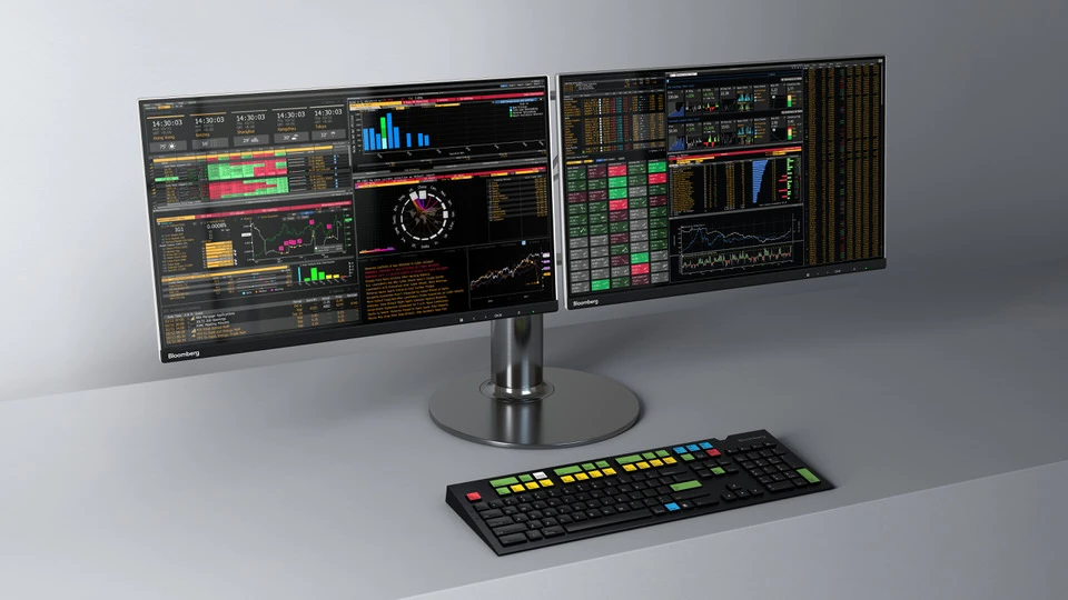 The beast that is the Bloomberg Terminal
“We have to balance innovation with familiarity,” says Bloomberg’s UX team, which “rolls out incremental changes to the Bloomberg Terminal’s interface every day – without disrupting our users’ workflows.” Translation: our users, who pay us $25,000 a year, do not want whatever you think a “better” UI is. They want predictability, consistency, speed, and prestige, and they’re willing to sacrifice (or they’ve already sacrificed) ramp-up time for it.
Improving design in your product
But we’re craftspeople, right? Right? I mean, I got into product because I love building things I’m proud of. I want to win as much as anyone, but building beautiful products is a big part of what motivates me. How do I integrate my dual goals of building something beautiful with maximizing my impact on the business?
The complex but accurate answer is that it depends on a few factors, including internal ones like how mature your product is and how good its current design is. It also depends on factors external to the product like what segments or verticals you target, competitive pressures, buyer/user expectations, and even your stakeholders’ attitudes toward design.
The average scenario is that your product’s design is decent, that it suffers from some inconsistency but that its design isn’t a deal blocker. In these cases, you have two jobs. The first is to make sure that every new feature you release fits into some design system. Over time, you’ll achieve more and more consistency, and if you’re building on a common framework, you’ll be able to make visual updates all at once, should you desire that in the future. The second is to pay down “design debt” when practical. When you’re updating an existing feature, consider whether there’s ROI in doing some refactoring to bring the existing feature onto the new/common framework. In some cases, the change management involved (with both internal stakeholders and customers) will mean the ROI isn’t there. Assess the situation honestly and use your judgment.
Less common and more difficult are situations in which the product looks like a design disaster. There are two sides of the spectrum here. Either the product is doing well and “great design” isn’t (and won’t be) a factor in your segment; or your product is temporarily succeeding in spite of its bad design and is on the cusp (or in the process) of being chipped away by better-designed upstarts. It is critical that you have a business-aligned view of which side of the spectrum your product is on.
In the former case, focus on consistency over visual flair. Use user-centric design methodologies to understand what users like about your product’s (bad?) design as-is. Do not break their workflows. You do not know better than they do. If you want to make major visual changes, proceed with extreme caution.
In the latter case, start from a business perspective: is bad design costing you new deals? Are your existing customers churning to more modern, better-designed competitors? Do your best to quantify the challenge. Use this data to have honest, clear-eyed conversations with your business stakeholders. At a previous company, I read and categorized hundreds of Closed/Lost notes in Salesforce to quantify our design opportunity. (It was huge.) Sales leadership and I were fully aligned that we needed to make design improvements, so getting them on the roadmap was trivial.
Finally, it’s possible that bad/inconsistent design could be hurting your velocity. Making changes across your product would be easier if you used common components, etc. But arguments that bad or inconsistent design is hurting development velocity are much harder to make — because they’re often much more difficult to quantify and in reality often hurt the business much less. Tread lightly here, and be honest with yourself: is this really how you’re going to move the needle for your product?
It’s easy to think about how we might want our products to be designed. We’re fortunate to be surrounded by beautiful things and an increasingly high bar in consumer product design. It’s much more difficult to figure out why we want our products to be beautifully designed. Let me know below: how do you think about why design matters in your business?
From the famous Steve Jobs quote about his father’s approach to quality and craft in his carpentry.↩